Fractals / Clickthecity by ALARICE FRANCISCO

FRACTALS by Edwin Wilwayco

Altro Mondo Arte Contemporanea is pleased to present FRACTALS, an exhibition of new works by artist, Edwin Wilwayco at the Altro Mondo Arte Contemporanea gallery (3rd Floor, Greenbelt 5, Ayala Center, Makati City).

The exhibit dubbed “FRACTALS” is described by the writer, Josephine Fatima Martins as “a series” in which “Edwin Wilwayco animates his continued explorations in actualizing conceptual and material holism”.

Martins further added that “similar to the artist’s previous visual constructions, Fractals are visceral paintings demonstrating the root plasticity and versatility of paint. At the same time, they are objective abstraction in that they reference forms in nature.

They follow the modern maxim: distortion and denaturalization of reality. Visual eloquence is achieved by alternating grades of form simplification and complexity.” The effect of which is a “deeply layered textural volume and vibratory space.”


Source: http://dev.clickthecity.com

10 Art Exhibits You Should See / SPOT.ph by ALARICE FRANCISCO

10 Art Exhibits You Should See This November
Date: November 6, 2015

(SPOT.ph) The year is almost over, but the art scene is still bustling with creative and talented visionaries. We've narrowed down 10 art exhibits that will fuel your imagination this November.

Fractals

Edwin Wilwayco presents intuitive masterpieces that reveal the malleability of paint in his solo show Fractals. His clarity is reflected in simplifying abstract through mirroring forms with nature. Fractals are literally endless patterns that are alike in different scales and Wilwayco cleverly created rhythmic and recurring visuals for this show. Wilwayco creates volume and texture layer after layer of acrylic and oil paint.
 
The exhibit runs until November 28 at Altra Mondo.
 
Altra Mondo is at 3/F Greenbelt 5, Ayala Center, Makati City (501-3270). For more information, visit Altro Mondo’s website.


Source: http://www.spot.ph

‘Fractals’: Wilwayco’s Geometric Turn / Inquirer by ALARICE FRANCISCO

‘Fractals’: Wilwayco’s Geometric Turn
Written by: Lito Zulueta
Date: November 30, 2015

EDWIN Wilwayco has taken a most dramatic shift in his abstract expressionism with his new “Fractals’ series of paintings.

After his “Bird of Paradise” and “Four Seasons,” series of works that took their inspiration from flora and clima, that is, from the most colorful and most musically resonant of nature’s phenomena, he has shifted to nature’s geometry, the materiality and mathematics of reality.

The result is an intriguing series of works that problematizes representation and gives art aficionados who champion his work an inkling on his creative process and the current state of his artistic mind.

His “geometric turn,” if we be permitted to call it that, is apparent in the title of the series.
“Fractal,” according to the Unabridged Webster’s Dictionary, is “a geometrical or physical structure having an irregular or fragmented shape at all scales of measurement between greatest and smallest scale such that certain mathematical or physical properties of the structure, as the perimeter of a curve or the flow rate in a porous medium, behave as if the dimensions of the structure (fractal dimensions) are greater than the spatial dimensions.”

Fractals are useful in modeling structures in which similar patterns recur at progressively smaller scales, such as coastlines, and in describing partly random phenomena such as crystal growth, fluid turbulence and galaxy formation.

A French word derived from the Latin “fract,” or broken, the geometric figure is useful for Wilwayco at this very mature stage of his artistic career, because it provides the governing metaphor, if not the trajectory with which, first, to limn or define his art by artistic “analysis,” which is to break down his art in order to see how the parts relate to the whole; and second, to enable him to tackle what is most critical today for a nature artist like him—the brokenness of the environment.

Commercial arts

At first blush, nature seems hardly the inspiration of “Fractals,” but rather sheer geometry, plastic design, and even commercial arts. There’s some truth to the claim of American art writer Josephine Fatima Martins in the exhibit catalogue that that the “source of inspiration and possibilities for ‘Fractals’ is contemporary fashion, home and architectural designs.”

It is noteworthy for one that the most ubiquitous icon in the series—the leopard spots—are a mainstay in design; one can see them in upholstery, women’s fashion, and even men’s underwear. But industrial-and-commercial design takes its most creative icons from the environment or from the history of artistic representation of nature.

Moreover, Wilwayco’s previous series have adapted themselves to the functional requirements of industrial design. Variants of the “Bird of Paradise,” for example, have been adapted into furniture. But while they assume forms of commercial design, they essentially remain artistic representations of nature. They bring the lines and colors of nature into the living room.

We mention the history of artistic representation because obviously Wilwayco considers himself along the line of abstract expressionists, whose pioneers saw themselves as inheritors or challengers of the traditions that came before them. And all artists worth their salt try to break new ground or at least, chart new directions for their art without however abandoning altogether the tradition that defined their art and style in the first place.

Wilwayco wouldn’t, for example, subscribe to much of contemporary or “postmodern” art’s declaration of the death of painting or, in the case of styles like his, of “Crapstraction.”

Modern tradition

To be sure, Wilwayco’s new series is along the line of Pollock’s action-paintings, Rothko’s “light-paintings,” Hofmann’s pictorialism and color relationships, and of course, Joya’s “tropicalism.” In contrast to many contemporary artists, Wilwayco modernist art tradition—his overall sense of history—is not puddle-deep.

“Fractal details” have been found in Pollock’s drip works, as Martins says. Wilwayco achieves those dimensions in the “Fractals” series which should be seen as such—as a series—so as to better guide viewers to the development of his art.

In the initial paintings, the leopard-spot as well as other icons—florals, geometrics—are directly shown and very visible. In later paintings, the spots and other patterns are obscured within spatial depth. In later groupings still, they seem to be erased, restored, and again, defaced and nearly obliterated. The effects are boldness of design and especially for the viewer, a sense of throbbing, kinetic space.

Much of the dynamism owes to the bold impastos, the gestural sweeps and style undercurrents, and even the erasures. The erasures provide an intriguing aspect to the works since they constitute the palimpsest that defines not only the push-and-pull, the trial-and-error crescendos of the creative process, but also the archival dynamics that establish the history of the work.

In short, the palimpsest points to the construction of “Fractals” and the series that came before it and which may have determined or given rise to the new series.

To some extent, “Fractals” is a practice in defamiliarization: it is a venture to seemingly new artistic terrain that is alien to those already familiar with the Wilwayco style.

Defamiliarization

Defamiliarization is a self-reflexive device for Wilwayco to raise the caveat that his art is after all a construction, that whatever its achievements in representing nature through abstraction may be, it is just a representation moored not on any one-to-one correspondence between reality and art, but on a system of codes and conventions that are tacitly agreed between artist and audience.

But “Fractals” doesn’t stop at defamiliarization. Contemporary artists invite attention to their art-making not out of critical self-awareness but because of self-absorption and their inherent spinelessness so that they can’t commit to anything outside of their narrow egos.

In contrast, defamiliarization is a Brechtian alienation effect that wakes the audience from their willing suspension of disbelief so that, alerted and aroused from the blissful lull they’ve been put into by the dramatic work before them, they can be impelled to critical action.

Therefore, by experimenting with “Fractals” and problematizing representation, Wilwayco realizes his second intention—to tackle in his practice the critical concern for the brokenness of nature.
It is noteworthy for one that fractals are used in modeling structures such as eroded coastlines or snowflakes, generally vanished landscapes. Many of these landscapes are in danger of sheer effacement and only through models of planning can they be restored or saved.

Effacement, extinction

Or will they be effaced again because planning and development are mere rearguard actions to save nature while in fact jettisoning or sacrificing it altogether in the name of progress and development? Do the erasures and the palimpsests in “Fractals” embody this push-and-pull, nay the Janus face, of liberal capitalism?

We must add here that the beautiful iconography of the leopard spots points to the danger of extinction facing animals which are poached and killed for their ivory tusks or their beautiful hides. Many of these animals are supposedly protected in wildlife preserves, but their situation becomes evermore precarious especially since their preserves obtain in very troubled hotspots. For example, the beautiful snow leopard’s endangered-species status is always heightened whenever we hear of the violence and chaos in Pakistan and Afghanistan.

Such evocations—nature’s beauty and bounty through art’s geometry and the dangers facing it because of man’s concupiscible appetites—make “Fractals” a very compelling series. All this should show that contrary to the rather pejorative connotation of the title of the new series, Wilwayco’s art is not going the way of fragmentation. It is rather going the way of depth, resonance and relevance.
Edwin Wilwayco’s “Fractals” is running at the Altro Mondo Arte Contemporanea Gallery, 3/F, Greenbelt 5, Ayala Center, Makati City. Call 5013270 to 71 or e-mail info@altromondo.ph.


Source: http://lifestyle.inquirer.net

Fractals / Altro Mondo Arte Contemporanea by ALARICE FRANCISCO


The 29th one-man exhibition of one of the most critically acclaimed Abstract-Expressionists in the Philippines is opening on November 5, 2015, Thursday 6pm at Altro Mondo Arte Contemporanea located at the 3rd Level of Greenbelt 5, Ayala Center, Makati City. The exhibit runs until November 27, 2015.

A 'Must-See' / Lifestyle Asia by ALARICE FRANCISCO

Art & The City: 5 must-see art exhibitions in Singapore this July
Written by: Pat Elicano
Date: July 3, 2014

Recalibration is featured as one of the 5 must-see exhibitions in Singapore this July.

Known very much for his lyrical and eloquent brushworks — a vital aspect when it comes to abstract painting, Edwin Wilwayco’s latest brand of emotive abstractions to Singapore from 8 – 31 July.

Conceived over nine months and his two studios in Rhode Island and Manila, the differing approach found in both studios have appeared to blend perfectly, creating new meanings and in turn, dialogue with the mystifying forces of nature — a central theme to this exhibition.

A complex yet enduring approach to abstract art involves several techniques such as drips and dribbles of paint, painterly marks, deep passages along with the occasional adding of sand and sack cloth convenes beautifully in an unravelling surface adventure for any viewer.

Expect no less than an intense vibrancy and energy from Wilwayco’s paintings.

Recalibration, Momentous Arts, 1557 Keppel Rd (Behind Southpoint) BLK C, #03-27. Singapore 089066, +65 9641 3235, www.momentousarts.com


Source: http://www.lifestyleasia.com

Recalibration / Momentous Arts by ALARICE FRANCISCO

Edwin Wilwayco (Recalibration Series)

A celebration of life and works of art fully immersed in its visual abstraction- RECALIBRATION, Edwin Wilwayco's One-Man Exhibition opens at July 8-31 in Momentous Arts, Singapore.If you're in Singapore, please drop by. You're all invited.

Momentous Arts presents Recalibration – a solo exhibition by acclaimed painter Edwin Wilwayco.

With more than three decades of sustained dedication to abstract painting, Wilwayco is regarded as one of Philippines important artist in the field of abstraction. He has been a major contributor to the development of abstract art in his country and is best known for his lush and lyrical paintings.

The series of works created over a period of nine months in his two studios in Rhode Island and Manila, incorporating improvisation in both techniques/processes that created new meanings and in dialogue with the mystifiying forces of nature. Wilwayco signature oeuvre is informed by deep spirituality, self-introspection and a reverence for the beauty and power of nature. The process of painting, an integral part of his artistic practice unfurls what the abstract master has come to be known for : lyrical & eloquent brushworks. The lush paintings of Wilwayco with their immediacy and accessibility in particular the artist’s construction process- painterly marks, deep passages, over painting animated with playful elements of drips and dribbles with the occasional adding of sand and sack cloth; keeps the viewer fixated on a surface adventure and affirms the artist passionate devotion to Abstract Expressionism. Their emotive power articulated across many levels from the tranquil to the exuberant and vigorous; expressively nuanced by colours and gestures. It is this that lends Wilwayco flowing paintings their intense vibrancy and energy.


Source: http://momentousarts.com

The Will, The Way and the World / Philstar by ALARICE FRANCISCO

A painter’s praise: “Painting is a lifetime work. I’m just blessed that God gives me the good health to keep on painting every day,” Edwin Wilwayco explains.

A painter’s praise: “Painting is a lifetime work. I’m just blessed that God gives me the good health to keep on painting every day,” Edwin Wilwayco explains.

The Will, the Way and the World according to Edwin Wilwayco
Written by: John A. Magsaysay
Date: April 7, 2014

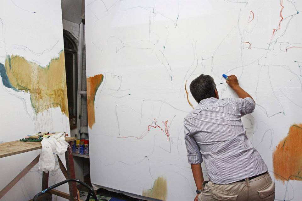
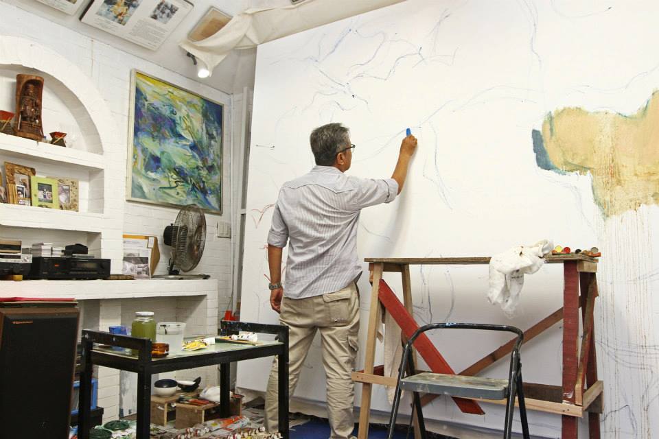
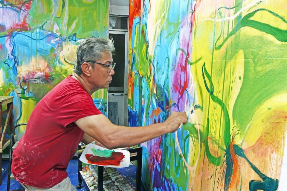
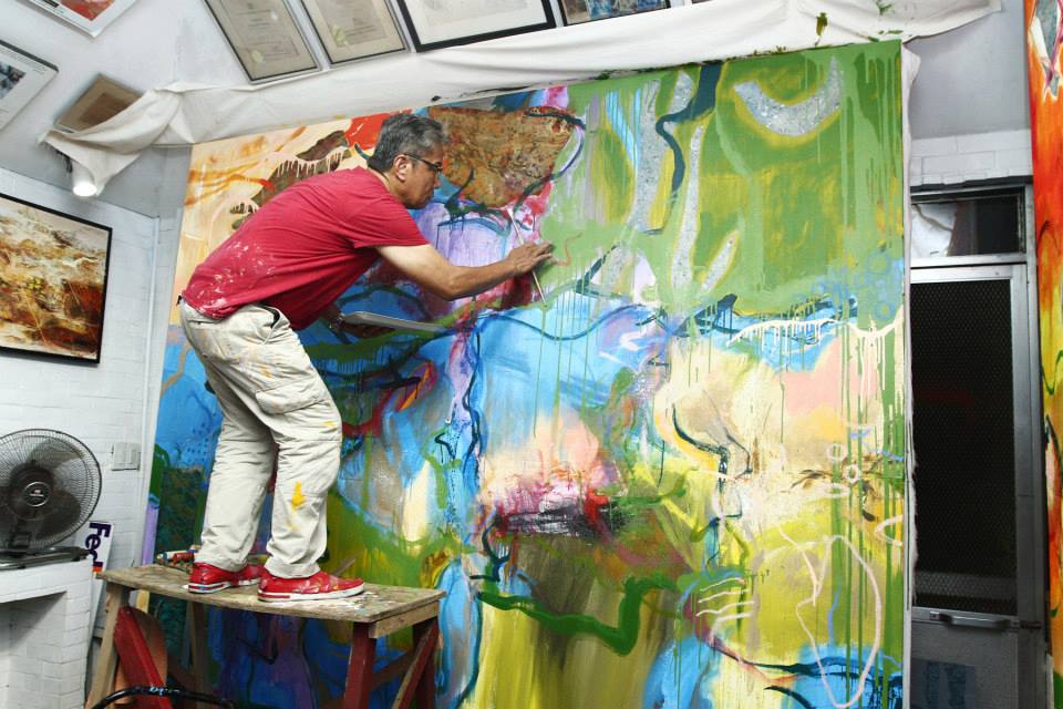
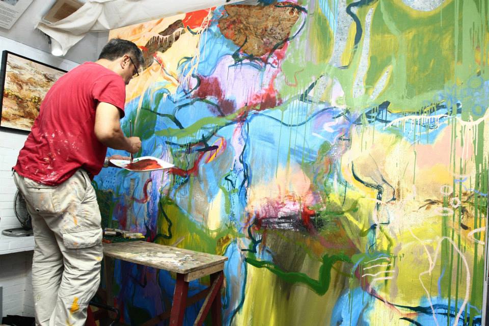
MANILA, Philippines - From the heart, I ask God, ‘Use my hands, my mind and my eyes.’ I cannot paint or hold my brush without saying a prayer. It is my proper beginning,” the artist Edwin Wilwayco admits, a modest maker looking to his Master as muse. With a prolific, world-renowned career behind him, a total of 14 solo exhibitions to match a lustrous 46-year repertoire, it is hardly believable that the inexhaustible abstract expressionist has not outgrown his pious devotion, to match what some artist as successful as he may have developed, the inflated ego. But Wilwayco has remained steadfast in his divine inspiration, a remnant of which, a prayer, hangs omnipresent on his waiting easel.

Wilwayco has gone through a lot of convictions, and while they may not be as recognizably represented in his dynamic brush strokes, strident textures, and vivid palettes, each one is as instrumental as the last. “In 1979, I had a show on the Philippine flag, as my flag series. The flag and its evolution were discernible in my paintings. I was young, and it was a critical success, but I only sold one painting from day one until the third year,” Wilwayco recounts of his first solo exhibition, while brimming with patriotic fervor, his art failing to strike the pulse of national interest. “At that time, I almost gave up on painting and just wanted to concentrate on advertising work,” he adds. If there was one thing good to transpire from it, however, it was Wilwayco’s acceptance as a British Council scholar for painting in 1982.

“There, my professor advised me, ‘When you go back to your country, why don’t you look for something very Filipino.’ So I opted to paint jeepneys, and that’s how I came up with my ‘Jeepney Fantasia’ series,” explains Wilwayco, his monumental comeback at the old Ayala Museum preludes the success of his other returns to come. The neon frenzy of jeepneys laden with vinyl stickers and multicolored kitsch, their sculptural quality fashioned off stainless steel offered a fantasy off the Filipino everyday trademark. From there, amidst the tropical landscape of his garden home, Wilwayco started to build on his “Heliconias and Birds of Paradise” series, which too, became a simmering sensation.

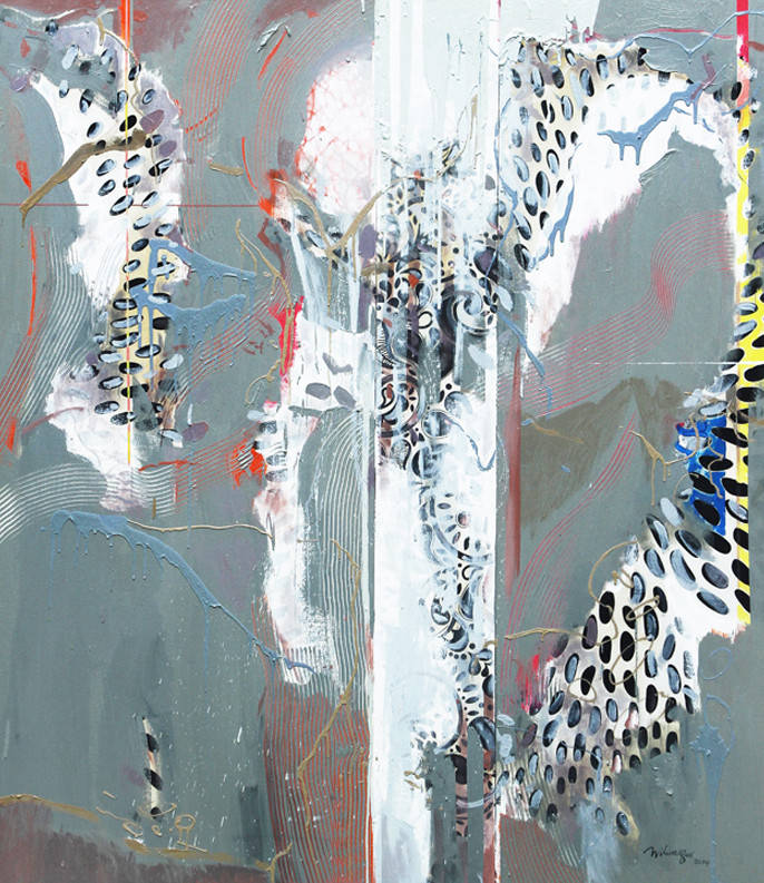
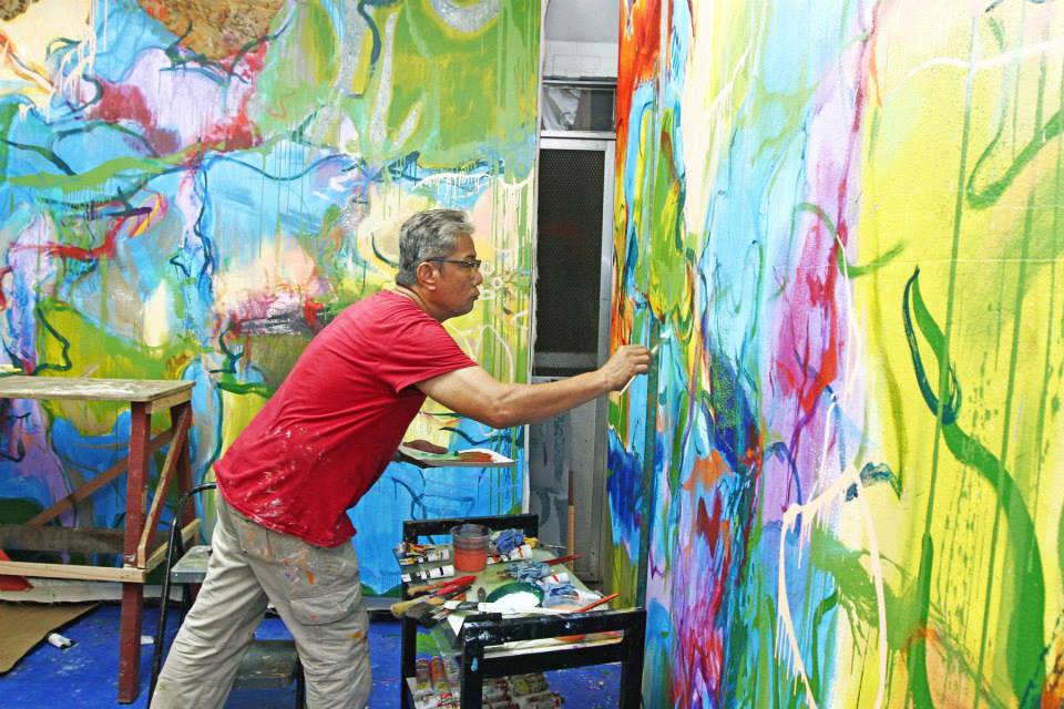
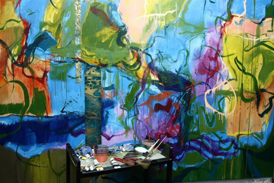
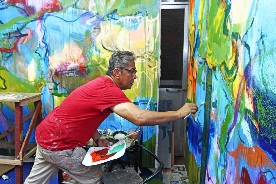
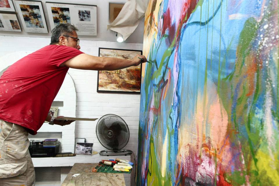
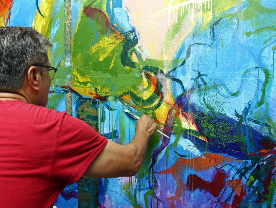
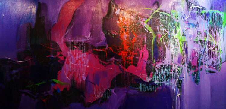
This newfound fixation on nature has sparked other well-received showcases, his latest one, the “In Nature’s Realm” series which debuted at the Gallery Duemila in 2012. “People don’t realize that even with nature, when you zoom into something like a leaf, it looks so abstract. No one can capture, or be close to the color combinations of nature. There are so many surprises that we tend to ignore. We just have to pay attention to the nuances — the blend of colors, the rock formations, or the leaves in trees,” Wilwayco’s tiny details giving way to monolithic imaginings heaving with fertile life, movement, and emotion.

“I’m adventurous; somehow, I like exploration. I always want to change my surroundings,” Wilwayco admits, that his nature series was stirred by the lush landscapes of two opposite continents, one, in his New England backyard, where he spends his time with wife Loby and daughter Moma in their Rhode Island residence, and the other one, in his Paranaque home where Wilwayco has built the verdant oasis of equatorial foliage. On these two coasts, Wilwayco divides his time painting, building an abundant body of work that awaits collectors, critics, and comeuppance.

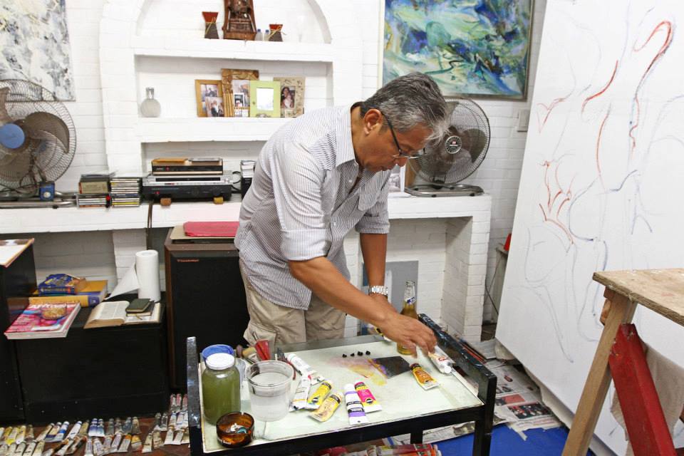
“It’s the only way I am comfortable with. It should come as though I’m not working at all, as though I’m only playing. And the fact that I am able to make a connection with collectors with the paintings that I make is the most gratifying response. As long as I sincerely believe that I am happy doing it, that I pour my heart into it, whether it would take one year or two years for that painting to be bought and appreciated, it has proven its merit, for me,” Wilwayco states, his style never dictated by his success.   

 “I have to please myself, that’s my gauge. I have to rely mostly on my feelings. There’s always this danger when someone sells too well, they tend to stick to a certain formula. I don’t look at my painting as a roll of textile, like, ‘Do you need two yards, three yards?’ You have to offer something different. If you don’t like this particular yard, there is always someone else who will,” he explains. It also helps that the constant spring of inspiration doesn’t run dry for Wilwayco, picking up insights from the wayward branch to the whimsical melodies of classical sonatas.

“Music will always be a part as long as I’m painting. I’m moved by music. But I’ve tried, many times, painting with popular music, Broadway, or trance, and they don’t work for me. But classical music, especially orchestra, solo or duets, moves me. It feels like I’m transported in time. I try to emulate the speed, the tempo of these compositions,” he reveals, his “Homage to Vivaldi” and “Scherzo” series a visually-audible response.

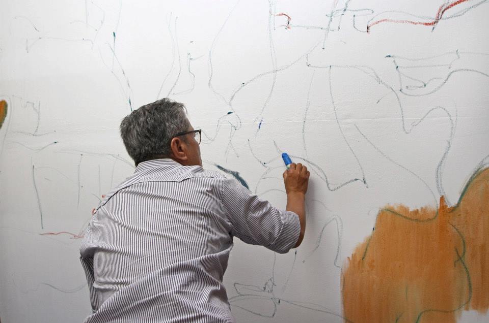
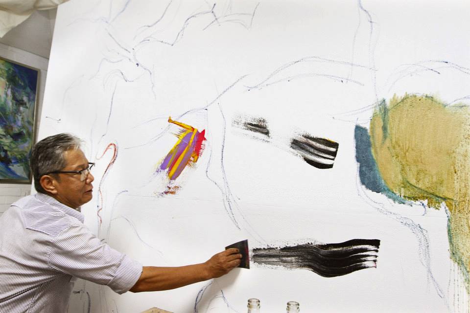
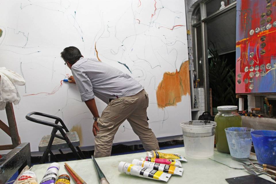
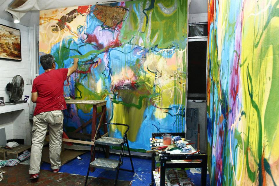
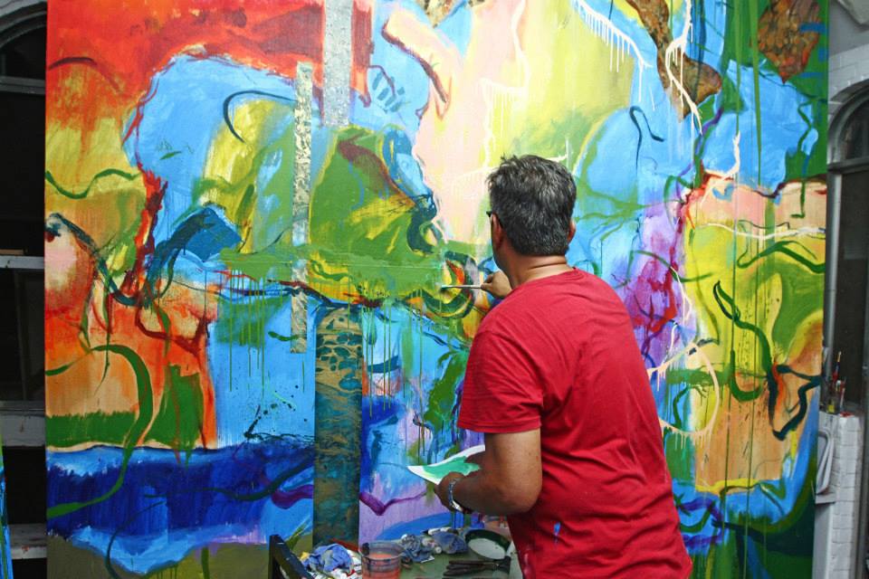
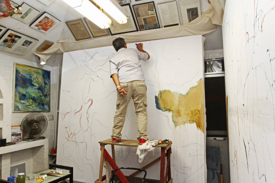
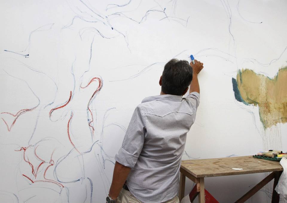
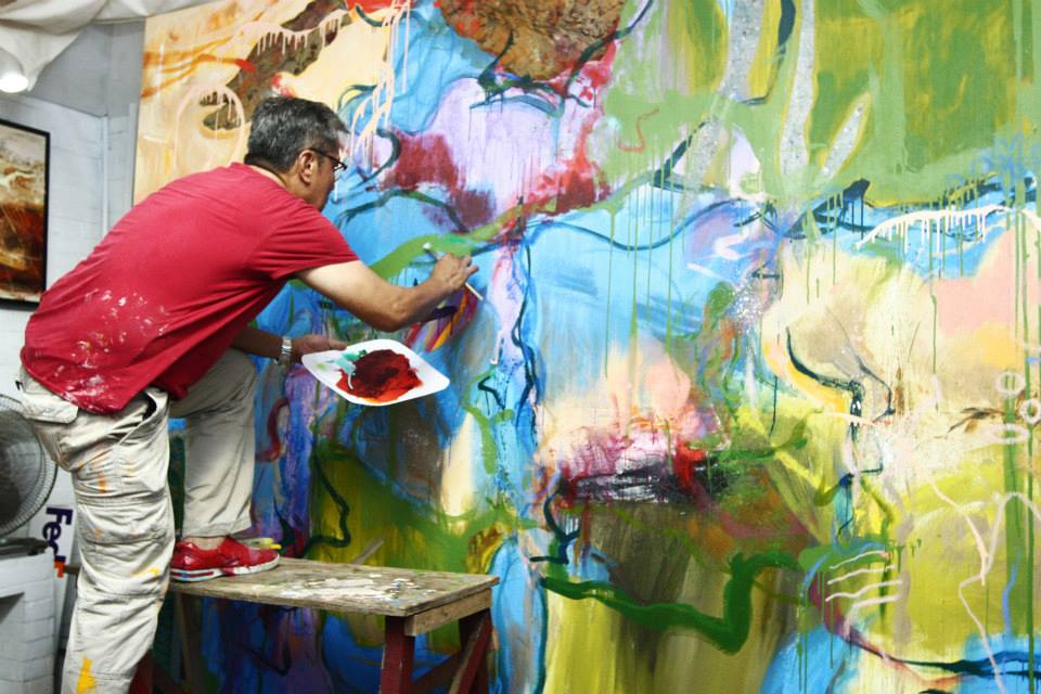
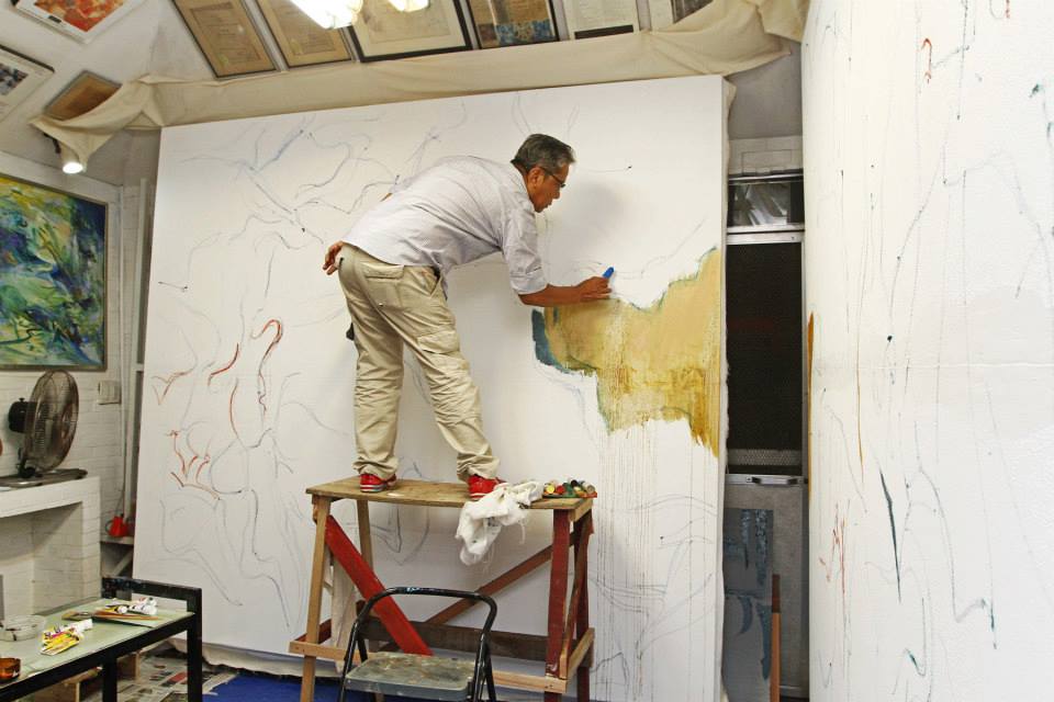
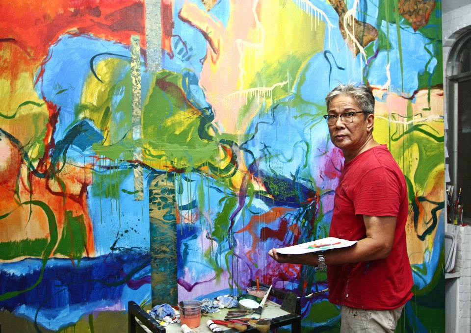
His penchant for the orchestral and its composers mimics the way he views his talent. “I can say I was classically-trained. I can do portraits, I can do landscapes. When you’re a musician, you can do improvisation if you are classically-trained — whether it’s jazz or popular music. Doing abstract work is a challenge because it’s making a painting I haven’t seen before. I don’t make studies, and it depends on my feeling,” he notes. Like melodies built with the progressions of tones, rhythms, and instruments, Wilwayco composes with a feeling, a flourishing palette, and a flight of fancy; the results are nothing short of symphonic.  

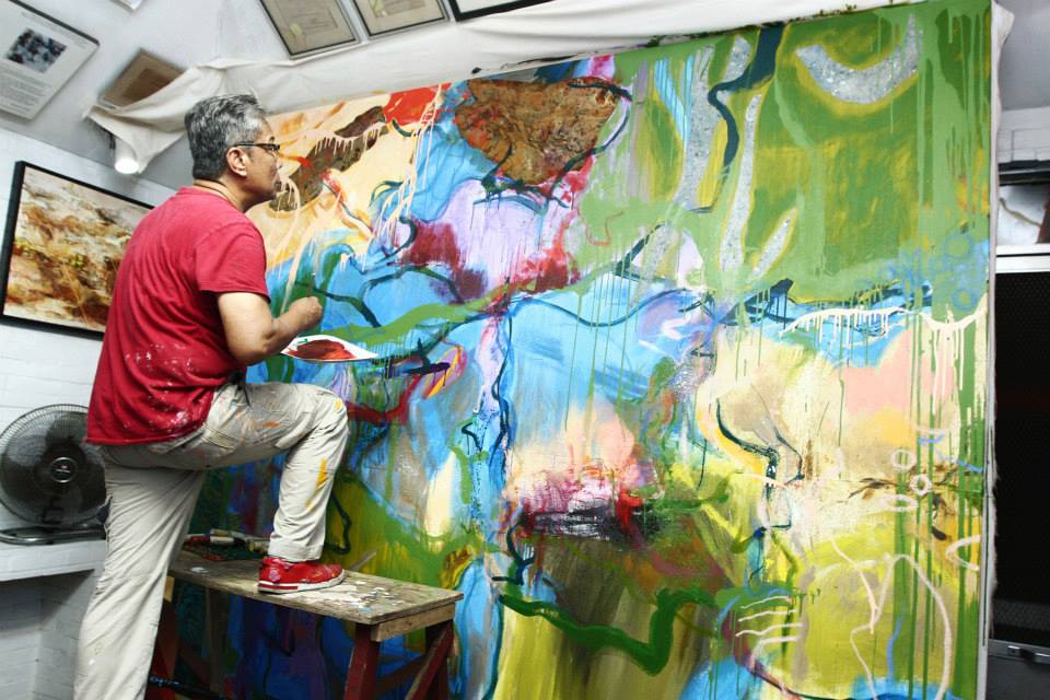
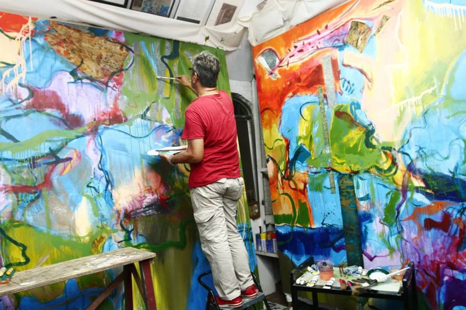
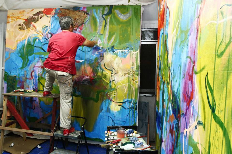
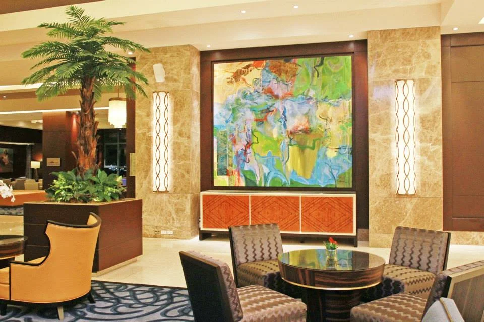
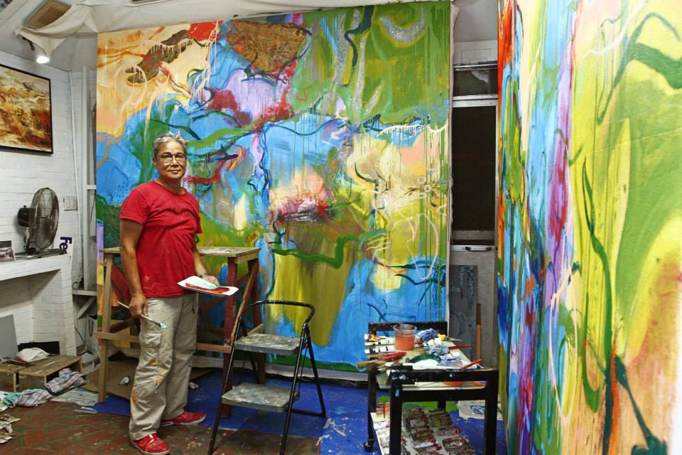
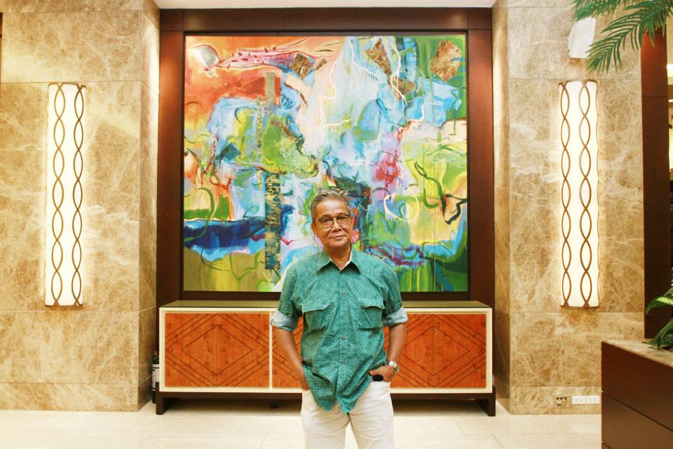
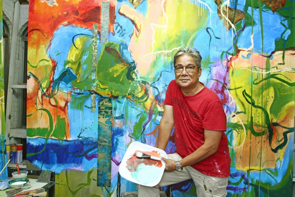
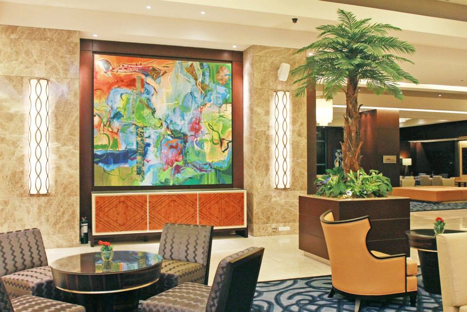
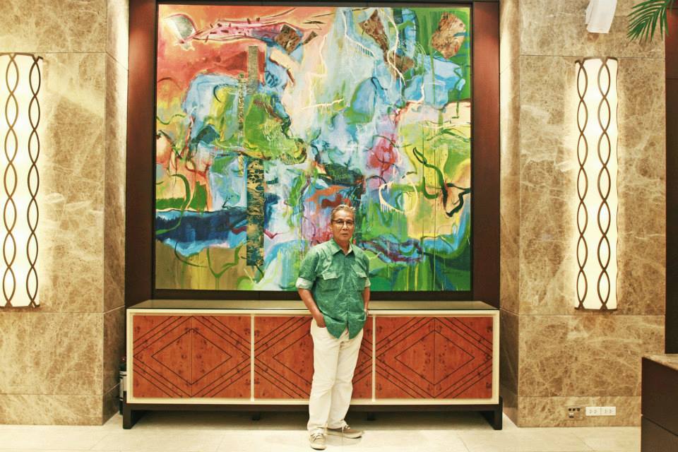
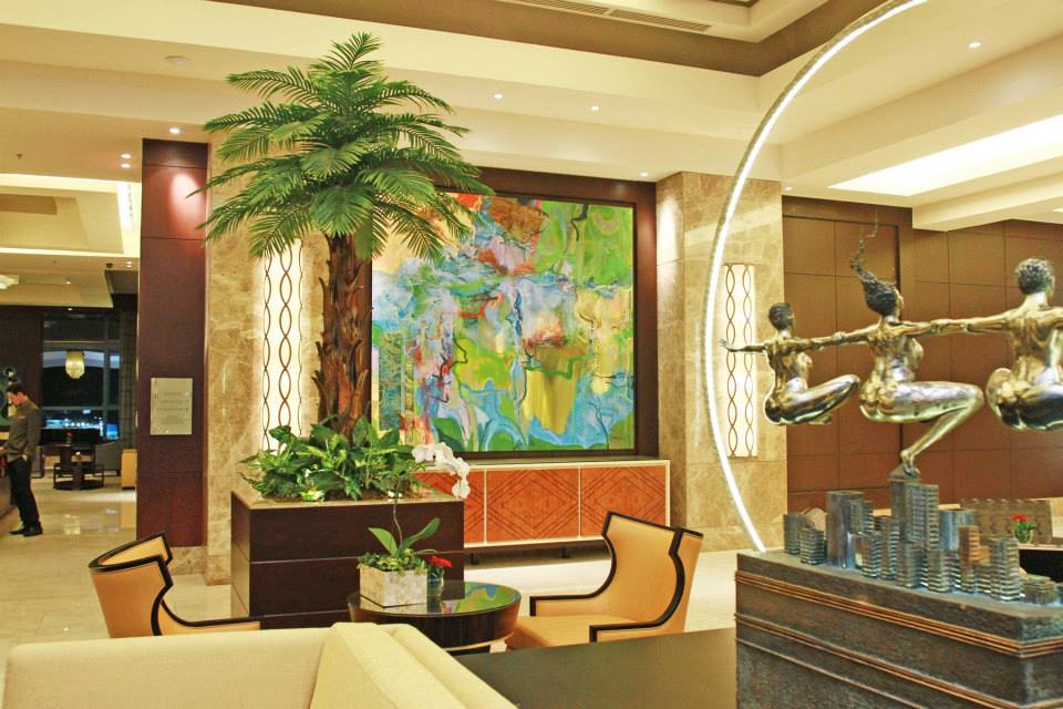
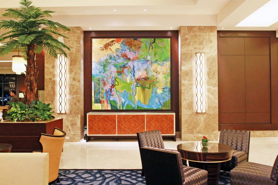
But just like his Mozart, Schubert, or Vivaldi, he knows better than to over-deliver. “Doing abstract opens up to a lot of accidents. When do I exercise restraint? When do I back off and not meddle too much? If I try to do too much, it will be destroyed,” he confesses, and this ascendency to self-editing has brought to life many quintessential Wilwayco pieces, whether it’s the spot-lit magnum opus at the Chabot Gallery in Providence, or the masterwork mural at the Crimson Hotel. 

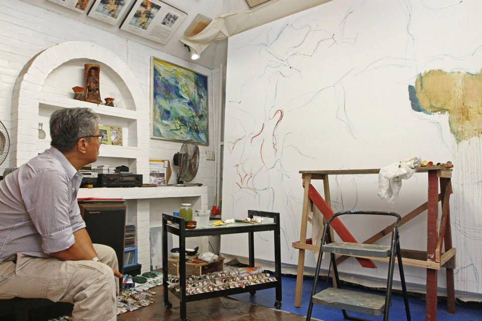
After having exhausted his earthly influences, Wilwayco transcends to the realm of the sacred in giving his latest series a new light. Titled “Recalibration,” Wilwayco’s fresh-off-the-studio collection will be showcased in Singapore this July, and it promises to be quite the revelation. “I am recalibrating in such a way that I am not paying homage to nature anymore. Is it veering towards being very abstract? Is it too mechanical? I cannot imagine what art critics will say or how my audience will look at my new work. Definitely, I can assure you, I will learn so much from how you see it. As long as you like my painting, then I will be very happy with that. You and I will have very different positions, will find different things on my paintings, and I leave it to you to see what you want to see,” he confesses.

If you see a sliver of hope, a slice of heaven, or even the face of God, it shouldn’t come as a surprise, because that is the miracle Wilwayco is building on. Having gone full circle from capturing life’s intricacies to the infinite world of the divine, perhaps Edwin Wilwayco has found yet another well of inexhaustible encouragement.

“Art will always be a reflection of God’s creation. We cannot even come close to what He created, but we can always offer a sampling. I admire so many artists, and all of them have their own strengths, and you realize that God won’t give you everything, but you have all these artists combined and there is so much wonderful art in the world. God really is the supreme artist,” he states.


Source: http://www.philstar.com

Wilwayco / Crimson by ALARICE FRANCISCO

Photo courtesy of Manila Bulletin's Pinggot Zulueta.

Photo courtesy of Manila Bulletin's Pinggot Zulueta.


If you see yourself at the lobby of Crimson Hotel and find a familiar painting, then it's none other than Edwin Wilwayco's.

Symphonic Strokes / Manila Bulletin by ALARICE FRANCISCO

Photo courtesy of Manila Bulletin's Pinggot Zulueta.

Photo courtesy of Manila Bulletin's Pinggot Zulueta.

Artist at Work: Mural in Crimson Hotel

Friend and photographer Pinggot Zulueta brightens the feature in Manila Bulletin and to Edwin Wilwayco's mural at Crimson Hotel through a photographic chronicle.


Source: https://www.facebook.com

Interview by James T. Valliere / Providence RI by ALARICE FRANCISCO

Edwin Wilwayco’s studio in Providence RI: Wilwayco & Valliere.

Edwin Wilwayco’s studio in Providence RI: Wilwayco & Valliere.

The art critic that interviewed Jackson Pollock, Willem de Kooning and critic Clement Greenberg is now up close with Edwin Wilwayco.

Edwin, your paintings have won wide recognition and acclaim in South Asia especially in your
native Philippines. You have also had many solo shows in Manila and Singapore. How did you first
become interested in art?


I was born in 1952, the eldest of seven children, in the small town of Guimba which is four hours drive from Manila. As early as the first grade in elementary school I loved drawing and doodling. My father showed me how fast he could draw cartoons. I think I got this penchant from him.

I always put drawings on the borders of my test papers. By the time I was in the third grade I became the ‘official illustrator’ of the class. My teacher always asked me for help making illustrations on the backboard. I remember drawing plants, amoeba and scientific illustrations.

My father often bought me art materials like pastels and watercolors. I used these to color the covers of Grimm and Hans Christian Anderson fairly tale comics.

What about your formal studies in art?

I studied and took part in many art competitions at the University of the Philippines College of Fine Arts, from 1968-1972. I was also very fortunate to be under the tutelage of professors who had studied art in America – from Cranbrook Academy of Fine Arts, Pratt Institute as well as Harvard and Yale.

I majored in advertising art with painting as a minor. My training was to be proficient in drawing the classical way, or realistically, from still life, nudes, landscapes and portraits.

My father had emphasized the need for me to pursue a practical avenue in the arts that would help me find jobs. That’s why I majored in advertising design. This led to my employment as an Art Director and ultimately to an Executive Art Director at an advertising agency.

This work involved developing visual graphic solutions, supervising television and photo shoots as well as designing print, logo and other corporate identity materials.

What kind of art did you study in England?

My art school studies in the UK were very important to me. England was very much ahead in art, compared to art in the Philippines. This gave me access to vast resources from museums and galleries as well as connecting with art students from other countries, the artists who were teaching and the visiting lecturers.

I loved the Tate Modern Museum where I saw original works by J.M. Turner and enjoyed the color palettes of Graham Suther, Matisse and Miro.

Artists I Admire

When and how did you start to do abstract art? What works inspired you?

My British Council Grant at the West Surrey College of Art and Design in England played a big
role in helping me to see art in new ways. I was in awe with how Mondrian was inspired to do his linear paintings and how he took realistic images to what became his signature rectilinear motifs.

The major artists for me were from The New York School. They were Jackson Pollock, Willem de Kooning, Franz Kline and Marc Rothko. I also acquired a deep interest in the works of Dibenkorn, Miro and Zao Wuo Ki.

Your reference to Piet Mondrian’s work is most curious. His paintings are so geometrical and his colors are so monochrome compared to your work. What did you see in his art that inspired you?

My work now and Piet Mondrian’s paintings don’t have any semblance or similarity. I admired his determination and openness in pushing his mind’s boundaries. He created paintings from experimentation with realistic forms to extreme abstract images, if we may call them that.

It was Mondrian’s use of the colors of blue, red and yellow with black outlines that do not clash that caught my attention. I find his colors to be classic, timeless and fresh even to this day.

Your art education was primarily influenced by teachers educated in the US and your time in the UK. You also mentioned famous 20th century American and European painters. Yet I detect an ‘Eastern’ quietness and sensitivity in your art. Where do you think that comes from?

As an artist it’s not easy to find one’s little niche – if I may call it that. I found elements of the works of many European and American 20th century masters to be compatible with my own evolving art style.

My sensitivity and sensibility to style allowed me to become closer to them maybe because of my natural temperament. I
borrowed some abstract painting methods of the West and fused them with my own spirit which can be meditative most of
the time.


You mentioned J.M. Turner’s paintings as being of interest to you. Can you say more about this?

What inspired me seeing J.M. Turner’s paintings at the Tate Modern was the overall feel and drama of his works. He can manipulate his colors and have them obey his hand and mind. I never paid attention to whether it was his attention to hide the paint or not. I just liked his brushstrokes as they provide a feeling of effortlessness. It’s as though he is just playing and that is what I want to emulate.


Why Color is Important


You mentioned how you were attracted to the way various artists used color. Have the vivid colors of flora and fauna in your native Philippines played a part in your color selections?

My fascination with color has been very strong ever since I was a child. My mother made clothes and I was given the privilege of choosing the textiles for her. I always chose prints with strong graphic designs.

Yes, the vivid colors of the fauna back home have played a big part in my color selections. I do think that this is what led me to be fascinated with the application of color in nature. I see nature demonstrating its beautiful colors in just one, two or three color combination.

In your series Birds of Paradise, I detect many floral design elements. Is this how your appreciation for color and design in nature impacts your art?

The intense natural colors and design I used in the Birds of Paradise screens caught my attention and led to the creation of many of my later paintings.

Floral designs for me lead to the curvilinear forms that I always find in landscapes. I see floral designs or patterns as part of the whole earth’s landscape.

What color theories have you
studied?


During the 20th century, the Theosophists developed elaborate concepts of the meaning of various colors. Also in the 1960s and
1970s Joseph Albers at Yale University had a major impact on color concepts. The color theory that I always find logical and useful are the color wheel, color harmony and the context of how color is used. I have always used color in my paintings that are analogous, complimentary and are based on nature.

I recall my professor in college, having been schooled at Yale, would often show us slides of Joseph Albers’ works with emphasis on the impact of color. Admittedly, the use of color in Albers’ paintings was dramatic and simple and
these had a great impact on me.

The use of color in nature, for me, has the greatest importance in relation to color theories. Every time I look at the colors of different flowers I marvel in awe at the transitions of color - the sudden, seamless shift from one hue to another. Color in all of its infinite variations is the very air I breathe. As melodramatic as that sounds, that is how I feel!

How I Paint

Your overall compositions are superb. I very much admire the way you use colors to make the forms in your art. How did you develop these techniques?

Art school in England prepared me to paint anything. I’ve always been fascinated with landscapes, seascapes along with sunrises and sunsets.

But when I paint I have no preconception of what I want to do. I let the painting develop according to my inner feelings and my moods. This is especially so when I work early in the morning.

I don’t even start with a color preference. I find the colors as I go. The colors in my paintings are juxtaposed for various changing effects. My colors are supposed to challenge or to echo each other.
 

How do you go about making a painting? Do you use preliminary drawings or sketches? What role do other visual images play in forming ideas for your art?

When I am painting I am not aware of what I am doing. I just go with the flow. It’s an easy give and take process until the painting is finished.

I have no fears of making changes, destroying the image, adding, or erasing. I try to let the painting come through on its own. I developed this process without knowing it. I believe that gesture in art must appear out of necessity – not habit!

I have always found that listening to classical music sets a helpful tone and helps me to create a painting.

Which classical music composers do you prefer to listen to when you paint? Which of their works do you play most frequently?

I admire and have always enjoyed listening to the music of Mozart, Vivaldi, Handel, Bach and Schubert. I am especially moved by Mozart’s Symphony # 40, Bach’s Obo Concerto, Vivaldi’s Four Seasons and Schubert’s Ave Maria. I play these extensively and repeatedly while I paint.


Do you paint flat on the floor or on a table top? Do you
tack the canvas or paper on the wall and then work on it?


The limitation of space in my Providence RI studio inhibits my using easels. I do sometime paint on the floor or table top. I do my retouching by tacking the painting on the wall.


I notice that you used both acrylic and oil paints. Why do you use both and how do you combine them?

I like to use acrylics when I start a painting. It’s an experimental exploration for me. It serves to set an outline and can define the composition. Acrylic dries fast and then I can apply oil paint where I want it and allow more time for the oil to dry.

Do you paint with a brush or any other type of instrument?

I use a brush most of the time, combined with using pallets, scrapers, sponges and whatever instruments that can help produce interesting visual results.

How do you know when a painting is finished?

I know when a painting is finished when I
think and feel that I cannot add something to it. I think it is more the ‘feeling’ that is finished that helps me decide to stop.

You told me that whenever you begin to paint you ask God for guidance. Do you say a prayer? Have you ever learned contemplation or meditation techniques? Are any spiritual practices part of you daily life?

I was raised by parents who were religious. For me it’s natural to say a payer before I start to paint. I ask God to be in control and to guide my hands. It’s a very short prayer. When the painting is done I say thank you.

For me the importance of prayer is that I do not have to wait for an inspiration or for a muse to speak to me. If I waited for this to happen I would probably never begin or finish a painting. If I miss saying a prayer before I paint, I feel sluggish and my mind tends to wander in many directions. Prayer for me is central to painting. It’s what sustains me and enables me to create.


Edwin, thank you, for the thoughtful and insightful comments about your life and art.


James T. Valliere’s interviews with Jackson Pollock’s contemporaries, including Willem de Kooning and critic Clement Greenberg have appeared in many publications and are in the Archives of American Art at the Smithsonian Museum. Valliere’s latest work is the Amazon e-book: Pollock: How Lee Krasner Built His Legacy.